A clearer view
of Cape Town's water.
I'm a Capetonian who watched the dams during 2018 and never quite stopped. This site is the result: a daily read of the six reservoirs that supply the city, drawn from the same public data DWS, the City of Cape Town, Open-Meteo and ESA already publish for everyone.
The numbers are not hidden. DWS releases a weekly state-of-dams PDF. The City runs a consumption dashboard. ESA's Sentinel-2 satellites map every catchment from orbit. Open-Meteo forecasts the rainfall. They're just scattered, technical, and a step or two removed from the question most Capetonians actually have: is the system getting better or worse this week, and what does that mean for summer? This site closes that gap.
What the dams are at right now
Combined storage, per-dam levels, this-week consumption, and a seven-day rainfall outlook for each catchment, set against the same week last year and the 2018 floor.
A Day Zero scenario tool
1,000 Monte Carlo simulations against a decade of weekly readings. Drag the rainfall and consumption sliders, watch the probability curve respond.
Long-form on Cape Town's water
Day Zero in full, the desalination question, the El Niño year, and a case study of the drought that nearly broke the system. Written for readers, not policy briefings.
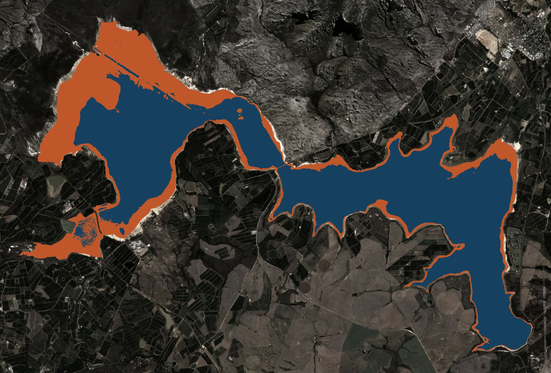
The dam that holds half the system
A monthly Sentinel-2 time-lapse of Cape Town's largest reservoir, 480 Mm³ when full, from the cracked lakebed of 2018 through to today.
Where every number comes from
Every input, every refresh cadence, every editorial judgement. For researchers, journalists, and sceptical readers.
I'm not a hydrologist or a journalist. I'm a Capetonian who lived through 2018, likes building things with data, and got curious about whether the official numbers could be read more clearly than they tend to be. The site grows when the curiosity does.
The combined system is at 73.6% right now. On its own, that figure tells you very little. Where does it sit against last year? Against the same week in 2018? Against what we'd need going into summer? Most of what this site does is paste those comparisons next to the headline number.
Nothing here is real-time and nothing is invented. Every figure traces back to a primary source. The data has limits — DWS publishes weekly, the City updates its dashboard once a week, the satellite frames refresh monthly, the rainfall forecast looks seven days ahead — and the site says so where it matters. The methodology page documents the chain of custody from PDF to pixel.
Open data, open tools, no ads. The only third-party script is a pageview-only Google Analytics tag so I can see whether anyone's reading this. Otherwise the site is a static build that reads JSON files committed by a daily scraper — no servers, no databases, just published numbers.
- · Astro · static site framework
- · React islands · only where interactivity needs them
- · Tailwind · styling
- · Zod · runtime schema validation on every JSON input
- · DWS · CCT · Open-Meteo · ESA · primary data
- · Netlify · hosting, with a deploy preview for every change